

Quick Answer: What Are the Five Chinese Calligraphy Styles?
The five main styles in the conventional classification are families of written forms. To distinguish them, compare several characters and notice their proportions, stroke endings and connections. [1][2][3]
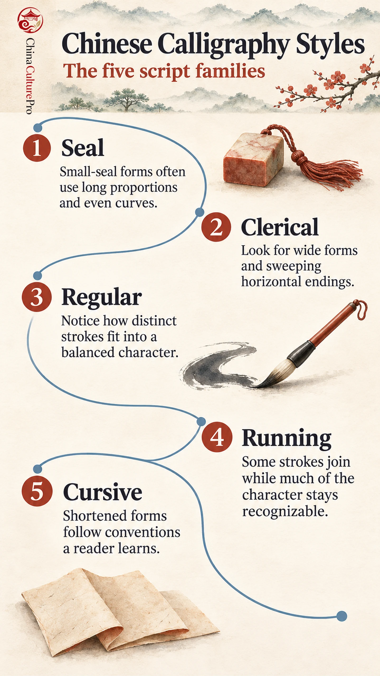
- Seal script (篆书, zhuànshū): Small-seal forms often look tall, balanced and evenly lined. [2][3]
- Clerical script (隶书, lìshū): Characters often spread sideways, with some strokes finishing in a broad sweep. [2][3]
- Regular script (楷书, kǎishū): Strokes are usually distinct within a clearly organized character. [2][3]
- Running script (行书, xíngshū): Some marks connect or shorten while familiar character forms remain visible. [2][3]
- Cursive script (草书, cǎoshū): Conventional abbreviations and connected movements can change a character’s appearance substantially. [2][8]
A single flourish or an isolated character can mislead. The repeated features of a line give a firmer clue. [2][3]
Look first at the whole column. Are the characters long or wide? Do the marks remain distinct, or does the brush appear to continue through them? The answers point to a script family. This comparison builds on the broader history and materials of Chinese calligraphy.
The Five Scripts Compared
| Script | Example to look up | What to compare |
|---|---|---|
| Seal script | Inscriptions on the Stone Drums, transmitted in a seventeenth-century rubbing | Look at curved structures and compare them with the symmetry of later small-seal forms. [3][4] |
| Clerical script | Cao Quan Stele, erected in 185 CE | Find a broad horizontal stroke and compare its ending with the thinner central part. [2][5] |
| Regular script | Inscription on the Sweet Wine Spring at Jiucheng Palace, model dated 632 | Look for distinct turns and endings within an upright, closely balanced character. [2][6] |
| Running script | Draft of a Requiem for My Nephew, dated 758 | Compare connected marks and varying spacing within a recognizable character structure. [2][7] |
| Cursive script | On the Seventeenth Day, fourth-century texts in a thirteenth-century rubbing | Look for shortened forms and linked movements in draft cursive. [2][8] |
Seal and Clerical: Look at Proportion and Stroke Ends
Small seal is one variety of seal script. Its relatively consistent proportions make a useful comparison with older inscriptions that museums may also classify under seal. It is associated with Qin standardization and often organizes long characters with relatively even curves. Earlier forms can be less uniform. The Stone Drums example gives a way to compare older character shapes with the more regular proportions you might see in a small-seal inscription. [3][4]
In many Han clerical examples, the sense of width comes partly from how the writer carries a horizontal stroke and releases it. On the Cao Quan Stele, look for a long horizontal whose inked form broadens or lifts near the end, then compare it with the shorter strokes inside the character. The difference within the same character can be more revealing than deciding whether the entire character fits an imaginary rectangle. [2][3][5]
Regular, Running and Cursive: Look at Connections
Regular script keeps the components of a character easy to locate. A writer can vary the force of a stroke and still leave a visible pause or break before the next one. Running script often abbreviates a movement or lets a thin trace link two marks. Even when the joins are pronounced, many underlying components remain recognizable. [2][3][7]
Cursive can alter more of the structure. An experienced reader learns which shortened forms stand for which characters. A continuous line may span strokes within a character or link neighboring characters. A more useful test is whether the writer has preserved the usual components, joined them, or replaced some of them with conventional shortened forms. For a closer comparison, see how to read Chinese calligraphy. [2][8]
Script, Hand and Medium Are Different Clues
A script names a family. A hand is an individual writer’s handling of those forms. A third question concerns the object you see. One surviving rubbing of Ouyang Xun’s Jiucheng Palace inscription comes from a Qing re-engraving dated to 1656. The Tang text was written in 632, and the rubbing was taken from the later stone. The date of the design, the date of the carving and the making of the sheet can differ. Compare the material distinctions in Chinese stone rubbings. [4][6]
FAQs About Chinese Calligraphy Styles
Which Script Is Easiest to Recognize?
Regular script is often a good starting point because the main components and individual strokes tend to be visible. Familiarity with the characters also matters. If you are practicing the forms, compare a regular-script model before moving to joined writing. [2][3]
Are Running and Cursive the Same?
Running script often keeps much of a character’s regular structure while joining some marks. Cursive can use more radical conventional abbreviations. There are works with features of both. [2][3][8]
Why Do Some Guides List Six Script Types?
The five-family convention groups seal, clerical, regular, running and cursive. Some historical guides also count oracle-bone writing as its own category. The two counts serve different ways of organizing the history. [1][3]
Sources
[1] UNESCO. Chinese Calligraphy
[2] The Metropolitan Museum of Art. Chinese Calligraphy
[3] Smithsonian National Museum of Asian Art. Understanding Chinese Characters
[4] The Metropolitan Museum of Art. Inscriptions on the Stone Drums
[5] The Palace Museum. Early Ming Rubbing of the Cao Quan Stele
[6] National Palace Museum. Inscription on the Sweet Wine Spring at Jiucheng Palace
[7] National Palace Museum. Draft of a Requiem for My Nephew
[8] The Metropolitan Museum of Art. On the Seventeenth Day