


Quick Answer: What Is the Thousand Character Classic by Zhao Ji?
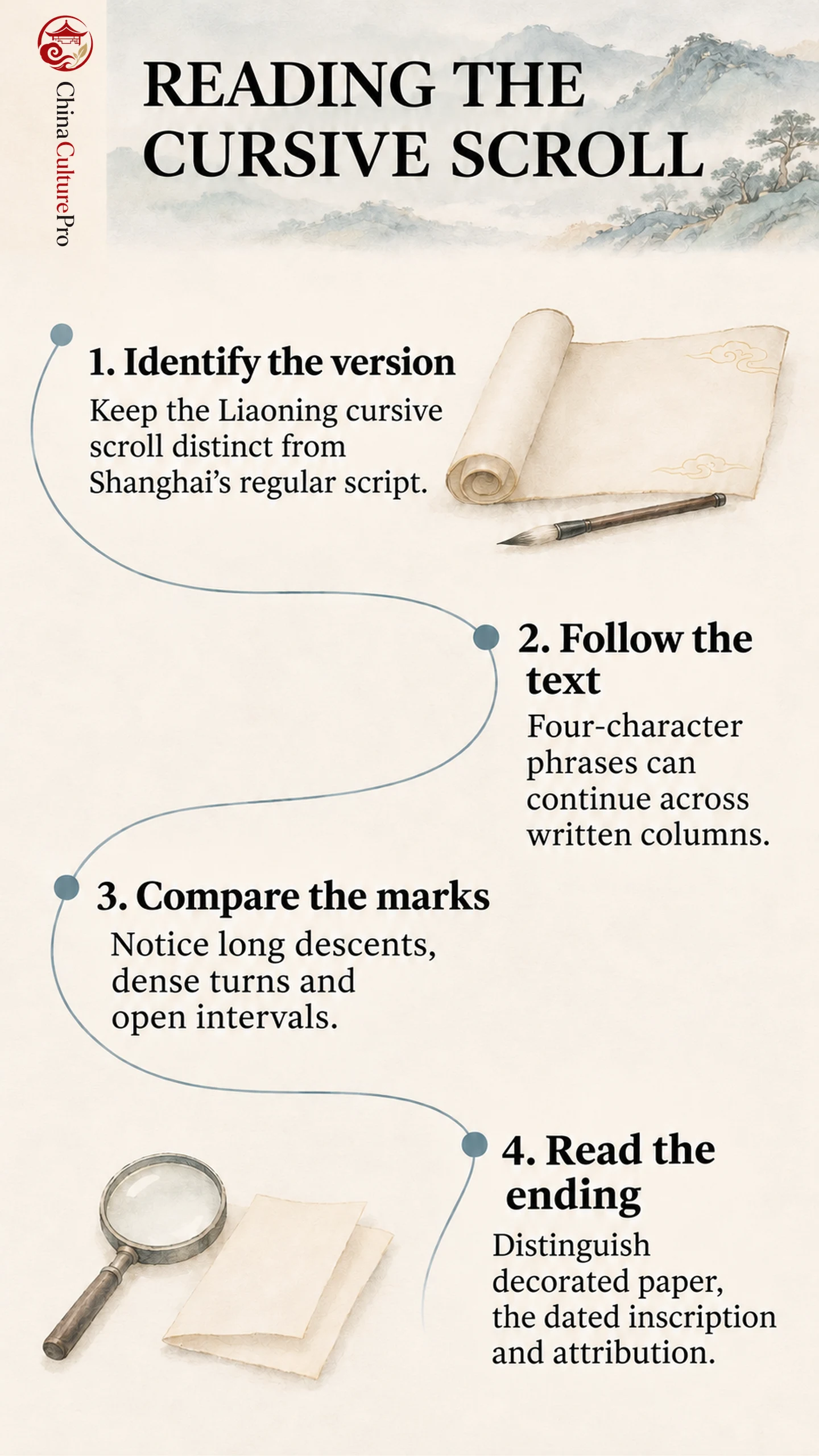
The Thousand Character Classic(千字文,Qiānzìwén)associated with Zhao Ji(赵佶,Zhào Jí), known as Emperor Huizong(宋徽宗,Sòng Huīzōng), exists in different calligraphic versions. This guide focuses on the long Liaoning Provincial Museum scroll in cursive script(草书,cǎoshū).[1]
- Text: An earlier primer rendered as calligraphy.
- Appearance: Black writing on decorated paper, with strongly varied character sizes and connections.
- Comparison: Shanghai holds a separate regular-script version dated 1104.[2]
A shared text and imperial association do not make the two scrolls interchangeable.
A long black stroke drops through otherwise open paper. Nearby, loops tighten into a dense group before another broad form changes the balance. Fine decoration remains visible behind the ink. Looking at these local contrasts makes the cursive scroll more approachable than trying to identify every character at once.
The Liaoning Cursive Scroll and Shanghai’s Separate Version
Begin by identifying which work a reproduction shows. The Liaoning scroll’s expansive cursive forms differ from the Slender Gold(瘦金体,shòujīntǐ)writing of the Shanghai Museum scroll. Shanghai’s own record dates its paper handscroll to 1104 and states that it was given to Tong Guan(童贯,Tóng Guàn).[2]
In the reproduced Shanghai detail, thin strokes define largely separate characters within red ruling. Angular changes of direction and extended diagonals are easy to pick out. These features make a useful comparison with the broader, connected forms of the Liaoning work, without making one a preliminary sketch for the other.
The cursive scroll’s final inscription corresponds to 1122; this is its inscribed date, distinct from the question of who made the surviving work.[3] Keep that inscribed date with this particular object. A caption attached to the 1104 scroll cannot be transferred merely because both captions say “Thousand Character Classic.” The guide to Chinese calligraphy styles helps distinguish a script category from a particular calligrapher’s recognizable manner.
The Familiar Text Recast as Moving Columns
The text is associated with Zhou Xingsi(周兴嗣,Zhōu Xīngsì), not composed by Zhao Ji. It served as an early literacy text and also supplied later calligraphers with familiar material.[3]
Its opening moves through the world’s physical order: heaven and earth, sun and moon, stars, seasons, clouds, rain and frost. Other passages turn toward rulers, conduct, learning, family relationships, agriculture and ordinary life. It offers a compressed sequence of subjects rather than a single continuous story.[3]
One section urges correction of faults and warns against advertising another person’s shortcomings while relying on one’s own strengths. Another brings friendships into the language of mutual instruction. Farther on, descriptions of palaces and officials give way to farming, withdrawal, plants, meals and household objects. These changes of subject help a reader locate a passage without assuming that every striking form illustrates a scene.[3]
Four-character phrases organize the text’s verbal rhythm, but the written columns do not consistently stop at those boundaries. A phrase can continue into the next column, and a conspicuously long stroke may belong within an otherwise familiar sequence. Read a transcription alongside the image, keeping the words’ grouping separate from the calligraphy’s spatial divisions.
These are historical teachings and descriptions within a copied primer. They should not automatically be presented as a statement of every modern Chinese reader’s values or as an autobiographical confession by the emperor.
Long Lines, Dense Knots and Open Paper
In one detail, a nearly vertical stroke extends almost to the lower edge of the writing field. Its slender length contrasts with the compact, dark formation above it. Curves in the adjoining columns take up different amounts of space; some turn inward, while others open outward.[4]
This contrast gives the eye more than one scale to follow. From a distance, notice the tall descents and broad sweeps. Closer in, examine the smaller hooks, compressed turns and fine lines between heavier marks. A light connecting trace can carry the eye onward without having the same visual weight as the main body of a character.
Gaps matter too. Around a long descent, a relatively open patch of paper makes the line stand out. Elsewhere, several marks cluster closely before the next opening. The writing’s variety depends on these intervals as well as on the shapes made in ink.
These comparisons offer a way into Chinese cursive script beyond identifying individual words. A reproduction shows the resulting forms; it cannot measure the exact pace of their execution. Nor does an energetic line prove a particular mood or political attitude.
Decorated Paper, the Ending and Attribution
The support deserves a separate look. Fine gold-coloured cloud and dragon patterns extend behind the black writing. In a close detail, the light catches parts of the decoration while broader ink forms remain visually dominant.[4] Paper decoration and calligraphic strokes are different layers of the object.
At the ending, the last large forms are followed by a narrower dated inscription, a stylized signature mark or huaya(花押,huāyā), and red seals. The change of scale distinguishes the text’s close from the elements that identify and collect the work. A signature-shaped mark is something to examine alongside other evidence, rather than a self-sufficient test of authorship.
The traditional attribution has been challenged. Wang Naidong(王乃栋,Wáng Nǎidòng)argues for a later copy, questioning aspects of style, the relationship with a rubbing and the earlier documentation. His essay also records the favorable 1988 specialist assessment of the scroll.[5] The institutional association with Huizong and this critical argument should be distinguished; neither the image alone nor the presence of a seal resolves the disagreement.
For more on the object’s horizontal presentation, see Chinese scroll formats.
FAQs About the Thousand Character Classic by Zhao Ji
Did Zhao Ji compose the Thousand Character Classic?
No. He is associated with calligraphic versions of an earlier text attributed to Zhou Xingsi.[3]
Is this the Slender Gold version?
The Liaoning work discussed here is cursive. Shanghai’s separate 1104 scroll uses Slender Gold regular script.[2]
Why does a four-character text have uneven written columns?
The text’s phrases and the scroll’s spatial arrangement serve different purposes; a phrase can run across a column boundary.
Fuentes
[1] Ministry of Culture and Tourism, China. Liaoning Provincial Museum: Collection Profile
[2] Shanghai Museum. Zhao Ji: Thousand Character Classic in Regular Script, Dated 1104
[3] Yang Renkai and Original Text Transcription. Zhao Ji’s Cursive Thousand Character Classic: Text, Inscription and Commentary
[4] Artron Exhibition Report. Liaoning Calligraphy Collection: Scroll and Detail Photographs
[5] Wang Naidong. A Critical Examination of the Attribution of the Cursive Thousand Character Classic